An impact report people actually read to the end.
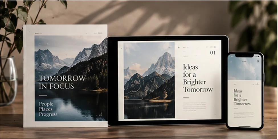
How A Brighter Tomorrow moved from a 60-page print PDF to an Edition made for the phones its readers carry.
- Client
- Client name
- Publication
- Annual impact report
- Made from
- InDesign package
- Live in
- 2 weeks
The brief
The report was beautifully designed for print: full-bleed landscapes, generous type, a careful rhythm from chapter to chapter. Online, it lived as a PDF that most readers opened on their phones and closed within a page or two.
The team wanted the screen version to carry the same character, be accessible to every reader, and belong to them rather than sit on a subscription platform.
What we made
- 01
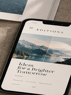
Faithful to the print design
The same typography, colour and chapter rhythm, rebuilt as real text that reflows on any screen.
- 02
Charts readers can explore
Key figures redrawn so they stay legible on a phone, with detail on tap.
- 03
Accessible throughout
Structured for screen readers and built to WCAG 2.2 AA.
- 04
Hosted on their own site
A self-contained Edition the team owns outright, with no platform behind it.
The outcome
Figures are placeholders until confirmed with the client.
“Placeholder quote from the client about how the Edition felt to read, and what it changed for the team.”
Read it the way its readers do.
Scan to open A Brighter Tomorrow on your phone, or open it here.
Read the Edition (opens in a new tab) (opens in a new tab)