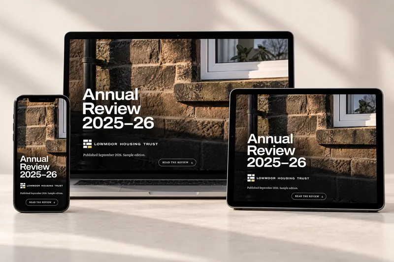
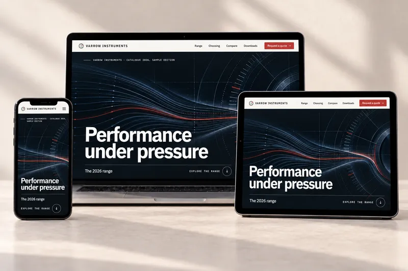
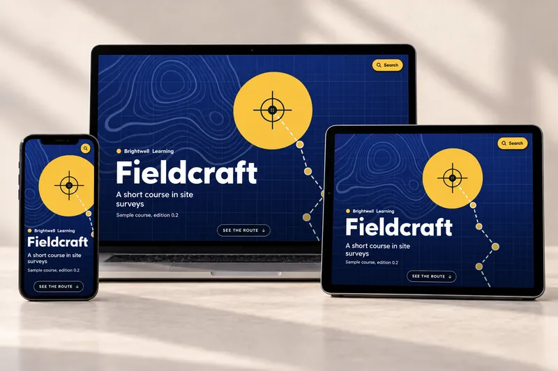
Why a PDF stops being a publication on a phone.
Most of your readers will meet your report on a screen the size of their hand. Here’s what gets lost on the way, and what it takes to bring it back.
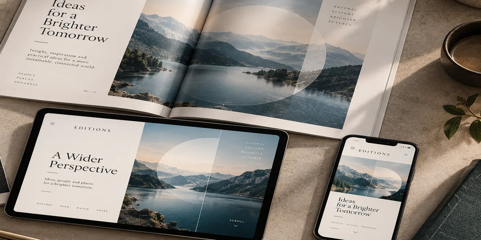
So much time goes into the publications we make. The ideas, the drafting and refining, the imagery, the layout, the typography, the meetings and sign-offs. Then the finished file is exported, uploaded, and sent out into a world that mostly reads on phones.
That last step is where much of the care quietly disappears.
What the PDF was for
A PDF is a brilliant way to send a page to a printer. It fixes every element in place, exactly as designed, so that what comes off the press matches what was signed off. That fixedness is the whole point.
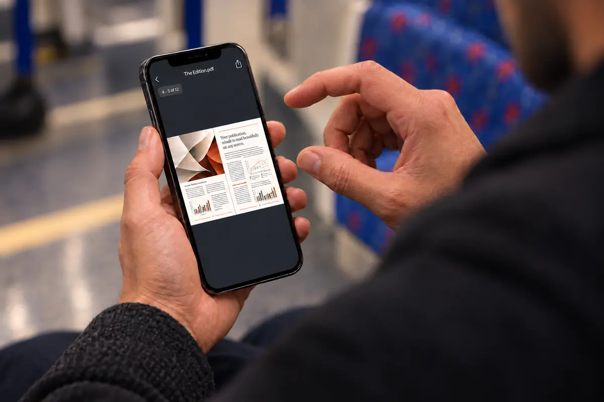
On a phone, the same fixedness works against the reader. The page is the wrong shape, the type is a fraction of its intended size, and the only way in is to pinch, zoom and pan.
A layout designed for print often falls apart on the screen most people will read it on.
Where it falls apart
The problems are rarely dramatic. They’re small frictions that add up: a two-column spread you have to scroll sideways through, a chart whose labels are too small to read, a pull quote that lands in the middle of someone else’s paragraph.
Flipbooks try to help with page-turn animations, but they keep the same fixed page underneath. The pace is gone and the structure is awkward.
Made for the screen
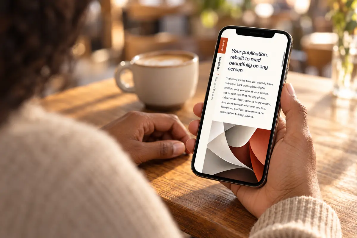
An Edition starts from the same source files as the print version, then rebuilds the publication as real text that reflows for whatever device it’s read on. The typography, colour, tone and pacing carry across. The pinching doesn’t.
Because it’s real, structured text, it’s also open to everyone: readable by screen readers, built to WCAG 2.2 AA and ready for the European Accessibility Act.
What to ask for
- Real text that reflows, not pictures of pages.
- Your house style, kept intact.
- Accessibility built in from the start.
- Files you own outright and can host anywhere.
The simplest test is to open both versions on your phone and compare.
 (opens in a new tab)